Transit 6.0: Let’s make public transit more beautiful
Finally! For ages we’ve wanted to tell you. Now we can finally rip off the duct tape and gush.
Say bonjour-hi to Transit 6.0. The same ol’ app you’ve adored for years, but with plenty of reasons to make you fall head-over-headways all over again. Like:
It’s our love letter to public transportation, designed to serve the utilitarian function you’d expect of an app for catching buses and trains — while honouring our shared human cravings for beauty and order.
So is everything in its right place now? Lord knows we tried!!!
Taking pointers from the greats
Public transportation is more than just a sustainable way of getting from a-to-b.
It’s the heart and soul of great cities.
When the industrial revolution started funnelling people into cities (and slotting them beside each other on buses and trains) public transportation became the seat of public life, as well as a gallery to champion the public spirit.
Plenty of time, effort, and money was spent on making it not only practical but beautiful.
Architects and urban planners have left no stone, seat, sign, map, or typeface unturned in their quest to capture the civic spirit, taking cues from local landmarks, history, and culture to inspire their systems.
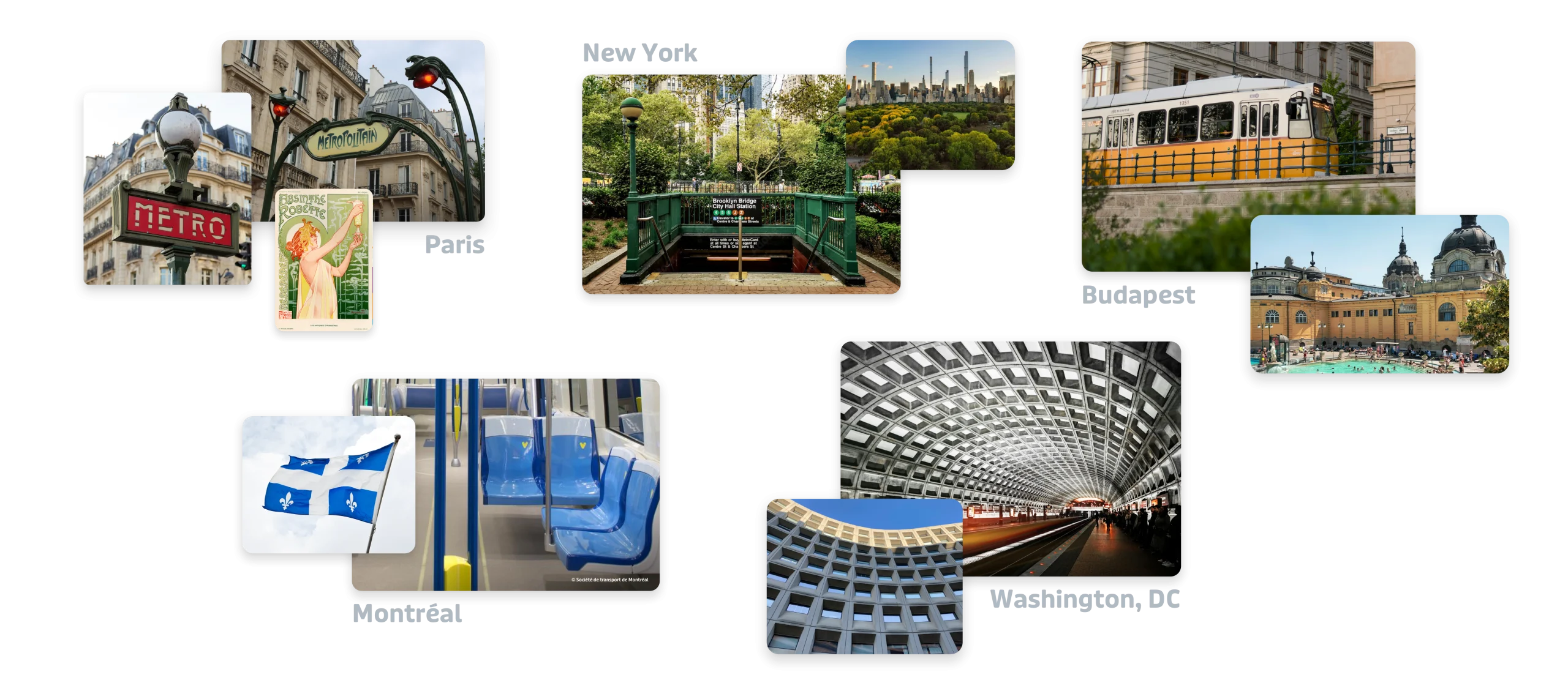
Our team at Transit is no different. Before we planted our shovels into the 6.0 redesign, we looked to cities that inspired us, the design choices that made those cities feel unmistakably “them”, and how we could radiate some of that magic whenever you open the app.
Priority number one? We had to confront a part of our design legacy that was uncomfortably unmagical: Interstate.
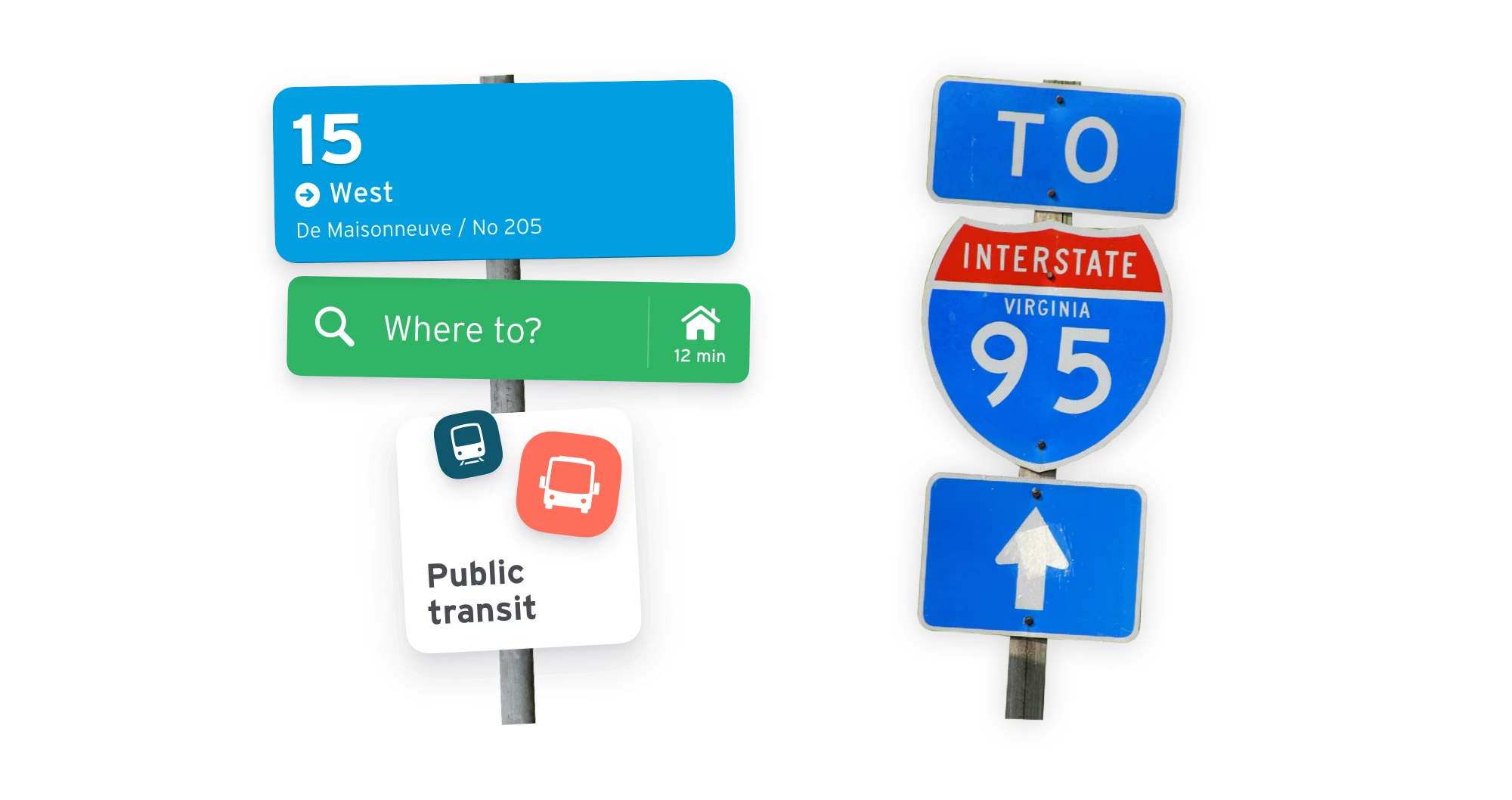
Interstate has been Transit’s typeface for over a decade. A cousin of Highway Gothic, it’s the Federal Highway Administration’s gift to typography — a font that’s perfectly legible at a glance. Perfect for an app like Transit.
Unfortunately, it’s also perfect for travelling 160 kilometres an hour in your grandpa’s hot rod.

Interstate is a workhorse of a typeface. But for all of its typographical horsepower, it’s not very fun, not very magical, not very evocative of the car-free cities we dream of here at Transit.
With 6.0, we needed a fresh start. A typeface that wasn’t emblematic of North American car culture. We had a good idea of what we wanted in Interstate’s successor. Something friendly, round, skimmable, charismatic, yet elegantly inconspicuous.
We searched high and low. In every nook and cranny. Where might we find the humanist, car-free typeface of our dreams?
We’ll let you take a wild guess!
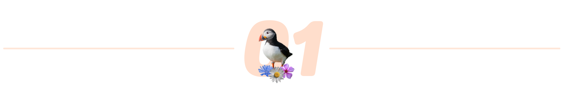
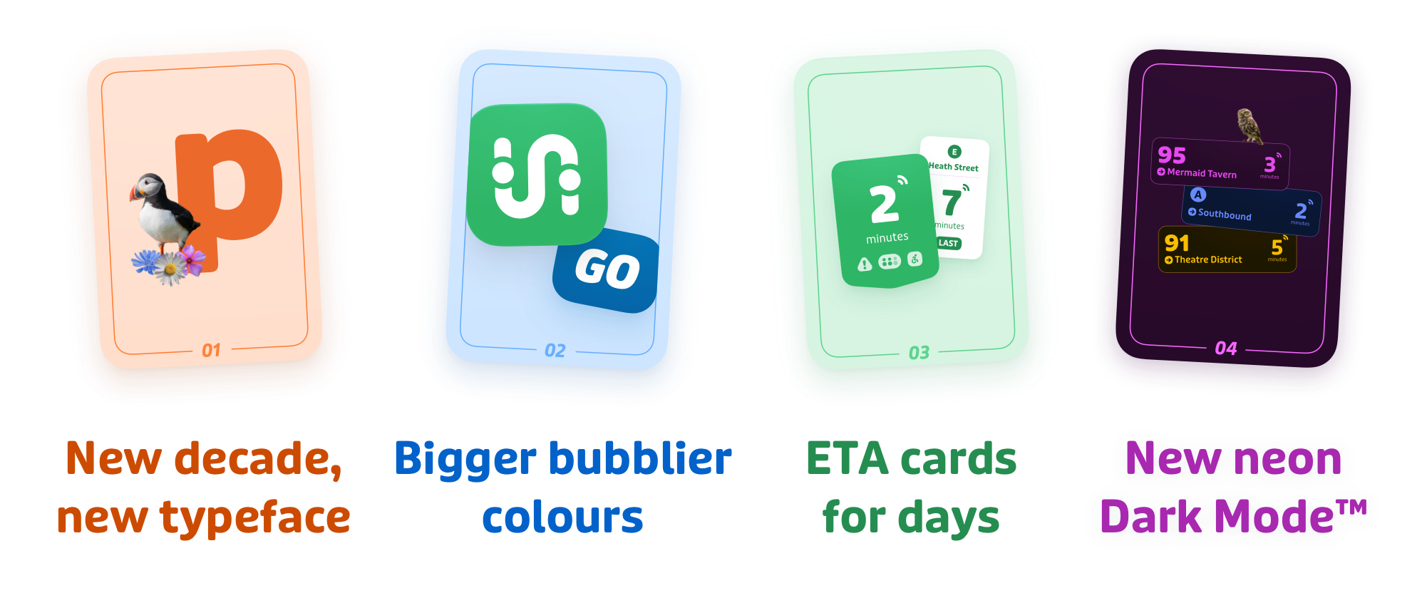
Introducing, Puffin
Designed by the Netherlands’ Pieter van Rosmalen and his team at Bold Monday, Puffin is the new face of Transit.
It struts. It swaggers. It’s a sans-serif that can hula hoop — legible at a glance, clean but not uptight, cheeky yet elegant.

Where Interstate sliced off its terminals with a scalpel, Puffin’s are chiselled with glee. Its numbers are a joy to behold, and so are the swooping descenders on glyphs like “y” and “g”.
We were absolutely smitten with Puffin… not least of all because it takes its namesake from one of the cutest animals in Eastern Canada: it’s playful, buoyant, and decidedly puffy.

Having settled on making it Transit’s next typeface, we got to work with Pieter. He took out his tailor’s pins and thimbles to make the off-the-rack version of Puffin more unmistakably “Transit”. He swapped its extravagant “3” and “4” for glyphs that were a bit more understated, whipped up a batch of French accents sweeter than crème brûlée, and dispatched a few other nigh-subliminal edits.

And thus, Puffin Transit was born.
For a typeface, it’s pretty puffin perfect.
But typefaces aren’t the only things getting a lift in 6.0…
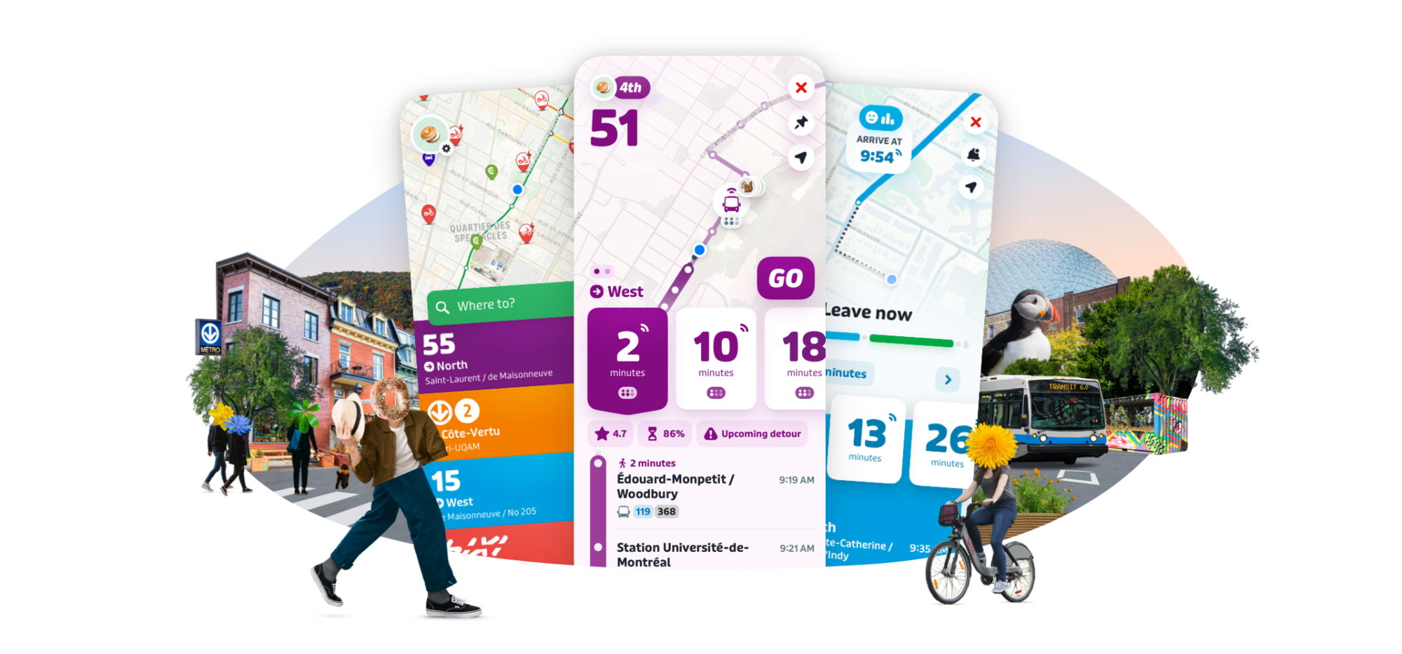
Hello bigger, bolder, bubblier colours
Transit is known for many things, but if our app was known for just one, it’d be the list of transit lines in big fonts and bold colours whenever you open the app.
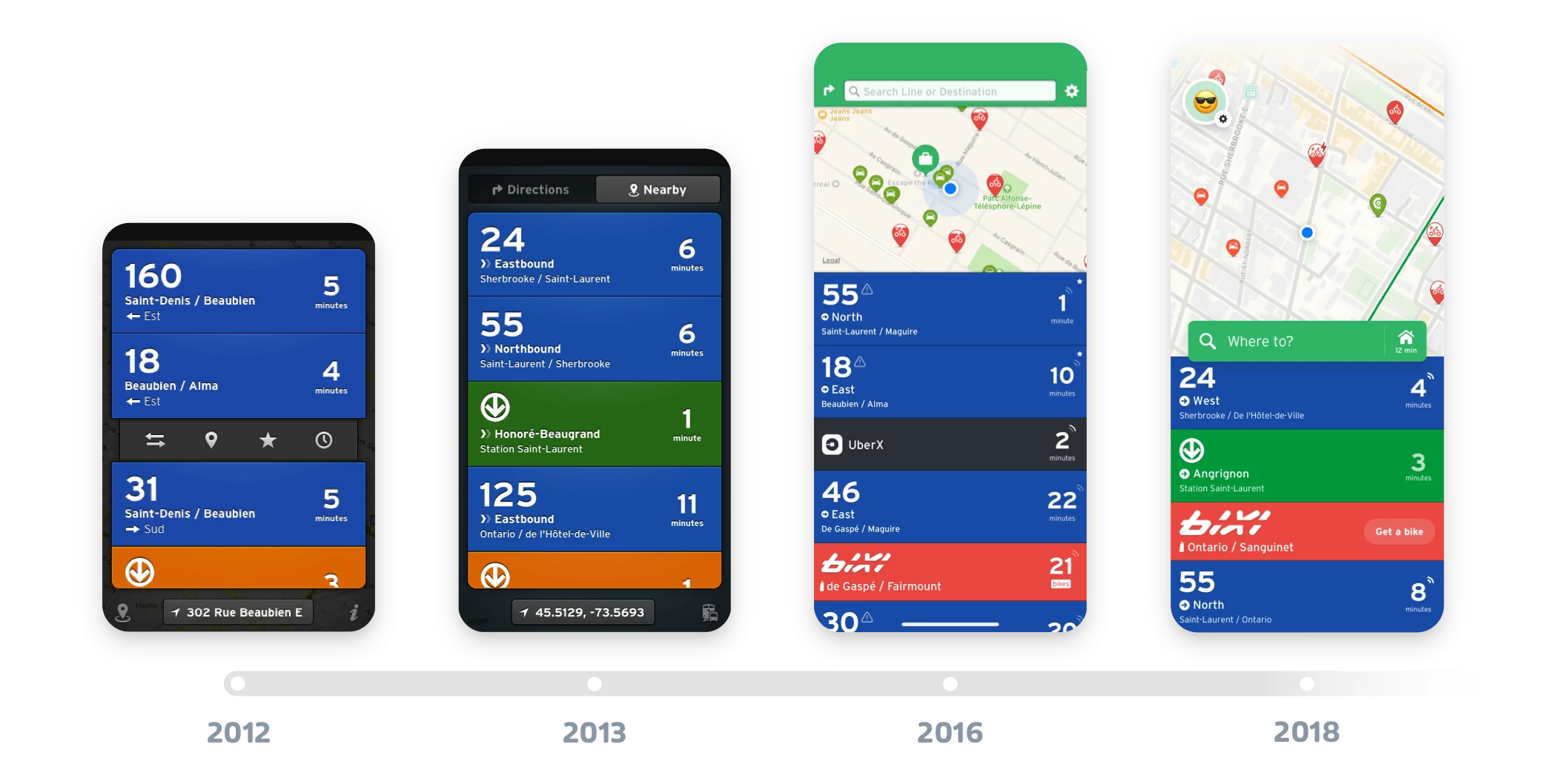
For the last few years, we’ve tried to bring that same, minimal, bright lights, big font ethos to other screens in the app.
Like the prompt we send you at the end of a trip, the settings screen, and the GO avatar selection.
For these screens, updating to Transit 6.0’s design style was as simple as adding Puffin. Easy.
Other screens, like our search, needed a bit more rearranging:

… as did our schedules:

Overall, one of the core goals of 6.0 was to avoid making you relearn Transit!
Most screens will look familiar — and intentionally so.
We’ve added more whitespace and boosted font sizes, but your muscle memory will find things in mostly the same places as before. If you barely notice our changes? Good! That’s by design.

However, a few screens, like our trip details and route details screen, needed more serious reconsideration.
Over the years, they’d gotten kinda cluttered:

…so we set about shuffling things up.

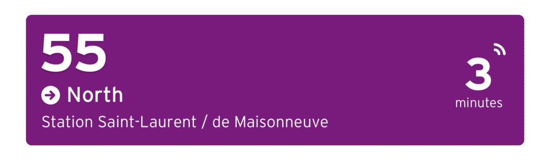
And thus was born: the ETA card!
People come to Transit for many things. But usually, it’s to look up ETAs.
Since Transit’s beginnings, ETAs have been front and centre on our homescreen. If Transit has one “eureka” design idea, it’s the big ETAs that let you find the most important info the moment you open the app.
… so why not put ETAs front and centre when you look elsewhere in the app?
What was stopping us? Turns out, nothing:

Transit 6.0 takes a magnifying glass to ETAs once you leave the homescreen, dialing up our squinty ol’ 18-point font to its now generous 60.
We’ve also started using these ETA cards as a one-stop hitching post for all your auxiliary route info.
Active alerts? Crowding levels? Accessibility status? Cancelled departures? Branch line? Alternative routes?

Before, all of that info was listed alongside the ETA, and competed for your attention. Now the visual hierarchy puts the ETA first, while grouping all the relevant info inside its new lil’ igloo home.
You’ll see ETA cards whenever you tap on a route, look up a-to-b directions, or start a GO trip:

The big, bold, bubbly colours make it obvious where to look, while the supersized font makes it superobvious when your next bus or train is coming.
You can now pick between alternate trips — tap a specific departure to chase down a tight connection, or opt for a different trunk line.

No skimming, no scanning, no thinking required. We’ve made all the info easy for your brain to digest. Bon appétit!

And this is where things take a dark turn…
Caves. Closets. Nightclubs. The Mariana Trench. Whatever lumen-starved environment you find yourself in, Transit’s now even easier on those oversized pupils of yours, thanks to our newly-designed Neon Dark Mode.

More than 50% of our users use Transit in its Dark Mode setting — a number which rockets to 75% once the sun goes down.

We’ve now put as much thought and attention into how the “default” Transit looks as its nocturnal sister.


We’ve swapped out Ye Olde Dark Mode’s background blacks and greys for new monochromatic midnight tones — thanks to a new smart, programmatic colour picker that uses your local agency’s route colours as a reference.
Colour theory freaks, this one’s for you!

As your eyes adjust to the new changes (and there are many! give ‘em a second!) we hope you’ll soon find yourself experiencing a refreshing new “ahh” feeling every time you open the app — the same feeling you get while walking around your favourite neighbourhood, best friend at your side, faces flashing by in the buses and trains, bikes purring, birds chirping, the chaos and hilarity and beauty of the urban circus unfolding, forever reminding you: I love this city.

To all those cities: thanks for inspiring us, year after year <3
The ITS UK Member News Service shares announcements and press releases from member organisations. The content is solely the responsibility of the issuing organisation and does not imply endorsement by ITS UK.